Saturday, November 6, 2010

WORD & IMAGE


When Brian Fies author of Mom's Cancer came into our DES001 class to give us a talk about many design concepts in relation to his experience as a graphic novelists I noticed that a big chunk of his lecture was focused on the subject of the interaction of word and image.
Brian places an emphasis on the interaction of word and image for his word; in particular- Mom's Cancer. I noticed, for example in this one strip that Brian showed us he explained to us how without words with the combination of images, the strip would not be as successful. This was the strip of when Cartoon Brian was talking on the phone with his father about his mother's condition. While the conversation between his father and him seemed like they were talking about one thing, the panels underneath the words were of dark images coupled with the underlying honest conversation they were actually having. If the dark images below the conversation were not present, the point of illustrating the two faced conversation would not have been as successful.
Another effective image that conveyed Brian's use of word and image was the image of his mother hearing her options on how to treat the cancer.
Brian Fies, panel from Mom's Cancer (copyright Brian Fies)
On this panel, Brian's mother is shown as walking on a tightrope. As the panel progresses towards the right, more animals and objects are added onto her balance beam- making it hard for her to balance over a pool of alligators. Certainly Brian's mother was never really walking on a tightrope but the message being conveyed was how Brian's mother really felt as she kept hearing her options and possibilities of treatment. It is really effective in illustrating just how scared and terrible she felt as the text on the panel was depicting what was happening in reality.
Finally another huge panel that effectively illustrated the interaction of word and image is the image of Brian's mother suffering.
Brian Fies, panel from Mom's Cancer (copyright Brian Fies)
During the presentation Brian was illustrating how this panel came into existence. First he was just sketching his mother laying in bed with messy bed sheets to convey how she felt. But as Brian was coloring, he ended coloring everything but his mother's body parts black. Surrounding his illustration were text boxes of just how much pain she was in, but the dark picture of his mother in pieces really reinforced and illustrated just how much pain she was in.
Brian concluded the lecture by letting us know that the interaction of word and image was why he chose to be a graphic novelist. The combination of words and images are just more effective than one or the other. Novels with books don't make it immature.

Monday, November 1, 2010

Design Aesthetics

When compared between art and design, many say that design has more of a "function" where is art is purely aesthetic.
However, there are plenty of designers that design objects that may not have any function at all, unless you count sitting on the table as a center piece, a function.
I think the function of an object and the aesthetic of an object are both very important in their own ways, especially to the consumer.
Of course, there are always extremes, some consumers may prefer a watch that is not aesthetically pleasing because if has several useful functions, whereas some (I notice as usually the rich) would maybe choose a watch that was expensive, very beautiful but only functions as a watch.
Although, most consumers and designers look for a middle area of both extremes.
For example, modern designers look for the best qualities when designing televisions. Televisions are an example of the best common ground between functionality and aesthetics. Nowadays, higher end televisions are sleek, smooth, and shiny all the while functioning as a high definition television with a thin LCD body to fit snuggly mounted on a wall.
Aesthetics play a big role for consumers of technologically. We see that refurbished goods are usually goods that are perfectly functional- just like the new product of the same model. Usually refurbished goods are sold at a lower price simply because a scratch or a dent was put on the product. This goes to show how aesthetics matter a lot parallel to functionality. Many consumers "trade up" from an aesthetically pleasing laptop to one that has faster or functionality.
As designers, we attempt to design objects that are both aesthetically pleasing, and possesses functionality.

Sunday, October 31, 2010

Form & Object in Water Bottles


Dating back into history, people have been using bottles or containers of all sorts to carry water around for drinking.
Even thinking about it now, I remember how water bottles looked like when I was a child:

Bottles used to be big and hard to carry around, but even looking at a typical bottle, we can see the content and form of the bottle already being improved or transformed by designers.
A couple years back, plastic bottles were the biggest resource for a travel sized refreshment. It seems that even as the water bottle got smaller just so it was easier to carry along, there were other problems found as a problem of the form and content of a water bottle.
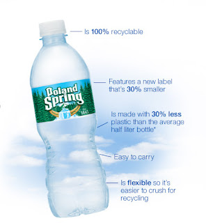
These are what plastic water bottles look now a days:


Designers found a problem with the content of a water bottle, so they improved on the form of the bottle. Now, as well as carrying convience, people also like to look at water bottles as a problem for the environment so a plastic water bottle is now referred to as a "ecobottle," with the plastic being a hundred percent recyclable, the label is now 30 percent smaller, and many other features.


In addition to designing a "ecobottle" designers have also started a trend of using refillable watter bottles that are BPA free. They have transformed the design and form of a water bottle by discouraging the use of plastic bottles.
Designers have taken the previous idea of hand grips, and smaller waists so it was easier and more stable to carry around. In addition to moving over those features onto the refillable bottles, there are also rings that make the bottle even easier to carry or even different bottle heads so make drinking easier or more convenient.
There are many mass produced manufactured goods that are produced with the same sorts of purposes. Whether we know it or not, designers are always improving and changing the designs of our everyday objects. If someone has a problem with the form or content of a object, there will be a designer there to help improve the experience or usefulness of an object.

Saturday, October 30, 2010

Content & Form in Objectified


According Lauer in "Design Basics" Form is "purely visual aspect, the manipulation of the various elements and principles of design." and Content "implies the subject matter, story or information that the artwork seeks to communicate to the viewer.
The documentary "Objectified" we explored many different aspects of form and content in various scenes from the documentary as well as the documentary as a whole and by itself.
I think the content of the documentary focused on the idea that everything is the result of design, in that everyday objects, regardless of whether people realize it or not, are designed for people. In order to convey the content and purpose of the documentary, the filmmakers utilized the form to convey the content.
In the documentary, we open to a scene of a manufacturing facility and the idea that when people see objects, they think of how much it object is, what it is, and what it does and etcetera. In the content of the documentary, they also emphasize how all objects were designed a certain way for a reason. The form of this idea was also conveyed in the introduction of the documentary. When we looked at how this chair was made we were shown how every part of it was created, the shaving of the chair leg and the puncturing of a hole on the back of the chair.
So, why was there a hole in the back of this "air chair"? Well, since it was a air chair, maybe the chair was designed to be light, so people can move it around easily. Maybe the hole on the back of the chair could allow the chair to be hooked onto something for stability or even for decoration.
We also see the interaction of form and content within the documentary. A big example shown was that of the vegetable peeler. When a design company heard that a typical metal handled vegetable peeler was not ergonomically comfortable, the company set out on improving the design of the vegetable peeler. They replaced the metal handle with a handle that was ergonomic. The handle was thicker, so the grip on it is more stable, there were grip ripples on the handle as well, and it curved to fit into the hands of average hand sizes.

Monday, October 18, 2010

Weekend Design


There are many ways t-shirts are made with different designs. http://shirt.woot.com/ is one of the biggest t-shirt producing companies based on the internet. This websites hosts weekly/montly competitions (a.ka. Derbys) for designers to submit a design on a t-shirt that matches certain criterias.
The reason why I am blogging about this website is because this weekend, I've had the pleasure of designing and submitting a design of my own to the website.
What happens during derby is there is a theme to each derby, and the designer has to follow certain requirements to submit a design. Some examples include submitting the design that has the correct theme, it has to contain less than 6 colors, it has to be a certain size, and NO STAR WARS designs. Then those who have a woot account may vote for the design, and the top three voted will receive 1000 dollars and a additional two dollars for each shirt sold.
This week's theme is "phobias". If you had a chance to look at the website you would see that there are A LOT of designs. It was really interesting to scroll through each design submitted because each and every individual design was unique. There were different styles of design present- seen through different use of colors, line formation, line thickness, and of course the design itself.
So, heres is what you guys have been waiting for- MY DESIGN! SO! If you guys happen to have a woot account please vote for me :D


What inspired this design was actually from my roommate. Hes had experience with his pets being afraid of the vacuum cleaner for some odd reason.
I didn't realize this at first, but the main colors used in this design were Primary colors! The reason why I made the vacuum cleaner red, was because that color was associated with Satan, evil, etc... And Blue- the opposite. Blue is light, happy, associated with heaven/sky.
Also, if you take a better look, the puppy is coming from a door that has yellow light- a happy place. The placement of the picture on the t-shirt also makes it look like the puppy was coming from the heart. In Lauer, he mentioned that designers tend to go for symmetry in their design. I noticed that I unconsciously did the same with my design.


Saturday, October 16, 2010

Comparison and Contrast


There are many things and life that can be compared and contrasted. When I think of comparing and contrasting a design, my first thought are dresses and clothing. Many dresses look alike, but are different in their own way. The same goes for everything else, whether it is writing style, drawings, paintings, furniture, photography- anything.
When thinking about blogging a compare and contrast piece, I started to search for yellow dresses. There are so many yellow dresses in the world, all in different price ranges- so I thought I'd write a piece on how I can take a expensive several hundred dollar dress and compare it to a similar 40 dollar yellow dress.
This proved to be quite a challenging piece to blog about so I looked for different inspirations. Looking at my very last entry I looked at the two paintings I posted. The paintings that expressed anger.
This will be referred to as Painting A

And this of course, Painting B

Again these images were found on http://www.expressivehearts.com/art_gallery.html, a very interesting and awesome website by the way.

When I first glanced at these two paintings, I immediately thought that it accurately conveyed anger. Although both of these paintings convey that feeling, there are many differences and similarities between the two paintings.
The first similarity I noticed between painting A and B is the use of "fierce" bright colors. For some reason, I feel that the designers of these paintings, like me thinking of these colors as "angry colors. The obvious differences between these paintings are the actual colors- Painting A being all red, and Painting B being orange, brown and black. The strokes on Painting A, to me seem a frustrated violent anger as the strokes are rough, as if the designer is sort of rapidly, stabbing the paintbrush all over the canvas. In painting B, the designer seemed to have more of a contained anger. The brush strokes are a lot more smooth, less rough and planned. The splashes of black show a bit of sadness mixed in.
There are many other elements that contribute to differences and similarities of these two pieces, some more obvious than others. Some differences and similarities can even be seen by others that can't.

Design as Conversation


Design can be a conversation, a type of communication from the one person/object to another. This can be between the designer and the design, the design and an audience, or the designer and an audience or in other words, a cycle of communication.
From experience I believe that design is a conversation. During times of frustration and anger I noticed that I personally drawing, write, or create things that reflect my feelings.


This painting found on http://www.expressivehearts.com/art_gallery.html is similar to what I tend to express when feeling angry. I find myself being really rough with a brush and I choose bright "fierce" colors. This example can be an example of a conversation between a designer and the design. It in turn can also include the audience in the conversation. Maybe the audience can understand what the design is trying to say or how the designer was feeling when it was created.
A setback to designing with a feeling is that it does not last. The conversation can be cut off abruptly when the feeling the designer started out with is no longer there. I may have started off the design with a feeling of anger for example, but if the design was left unfinished, it can be hard to finish the "thought" again. Many unfinished piece of design remain as a result. Alternatively, if the conversation is continued- even with a different feeling, the conversation may suddenly switch topics. This is typical in human conversation as is design as conversation. Looking at one end or one angle of a design can change the feeling or meaning being communicated to the audience or design.
A very good example of design as conversation is a piece designed by multiple designers. My group's stone soup design can be an example of conversation.

Because every piece of this design was created by a different person and ultimately put together, different views and angles of this piece convey a different feeling or idea. Every designer did not have the same exact feelings that day, so maybe every unique piece says something different to someone. Not only that, a completely different conversation can occur over the same object with the same angles, it really does depend on the person, their individual thoughts and feelings.